
Carpet Fibres & Materials · KARATILE B2B Flooring Knowledge
Architect-Inspired Palettes: Using Carpet to Build Spatial Atmospheres
For “Architect-Inspired Palettes: Using Carpet to Build Spatial Atmospheres”, do not rely on one material name, number or marketing claim. Turn a spatial concep
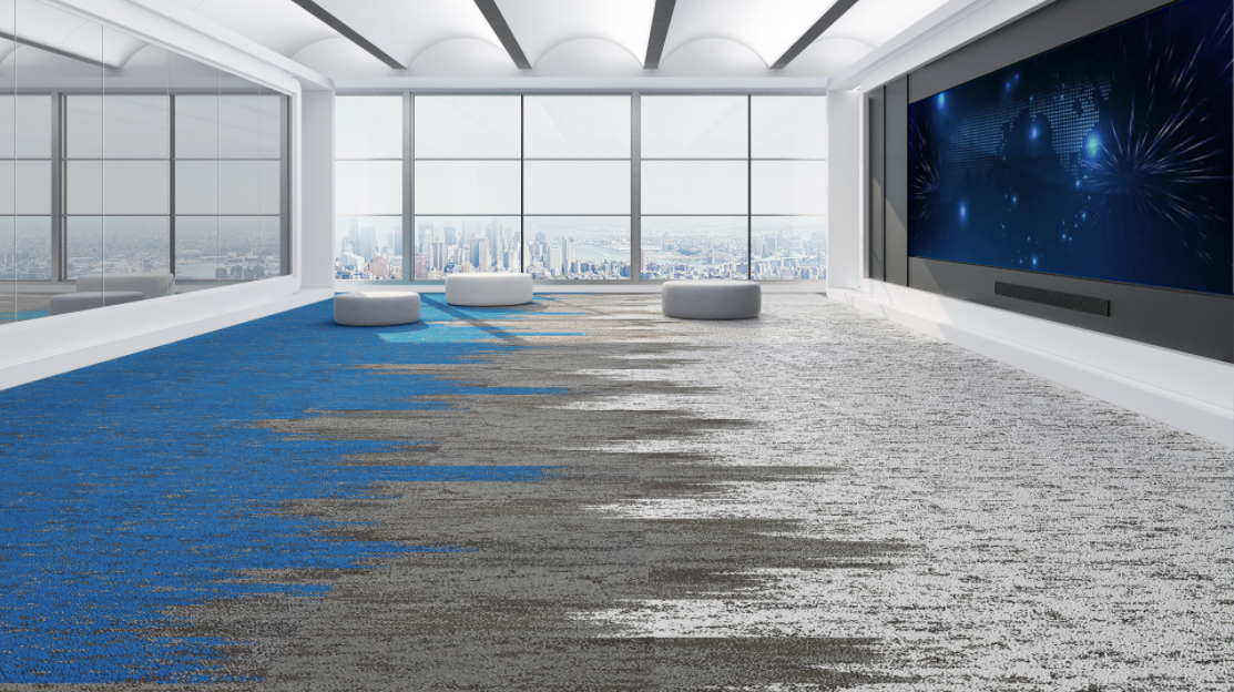
Direct answer
What decision does this article support?
For “Architect-Inspired Palettes: Using Carpet to Build Spatial Atmospheres”, do not rely on one material name, number or marketing claim. Turn a spatial concept into a floor language that can be sampled, laid out and handed over. The decision must trace to project conditions, samples and product-specific evidence.
This guide is for interior designers, architects, brand-space leads working together during comparison, project review or pre-delivery checks. Use it with the actual zones, traffic, schedule, budget and available documents.
Turn a spatial concept into a floor language that can be sampled, laid out and handed over.Ready for project review
Key takeaways
- 01
When evaluating “Architect-Inspired Palettes: Using Carpet to Build Spatial Atmospheres”, first document the zones, traffic, schedule and maintenance assumption
- 02
Direction, proportion and rhythm can differentiate spaces within one collection.
- 03
Renderings shortlist options; physical samples under project lighting approve them.
- 04
Complex layouts need agreed modules, datums, edges and waste allowances.
Answer blocks
Turn the core question into actionable answers
What should be checked first for “Architect-Inspired Palettes: Using Carpet to Build Spatial Atmospheres”?
Confirm the relevant zones, intensity, schedule, budget and maintenance conditions, then verify each conclusion against physical samples, the exact data sheet and valid evidence.
How are colour and texture controlled?
Set base, secondary and accent ratios, align texture scale and direction, then check colour and repetition in a larger mock-up.
How does design transfer to installation?
Issue coded products, layout, arrows, datums, edge details, waste and approved-sample references—not a rendering alone.
Color, in the minds of architectural masters, has never been mere decoration—it extends spatial emotion, partners with light and shadow, and silently shapes atmosphere. While we may not replicate their built masterpieces, we can draw from their chromatic philosophy, using carpet as a medium to lay down richly layered foundations for our spaces.
Learning from Tadao Ando: The Grey Narrative
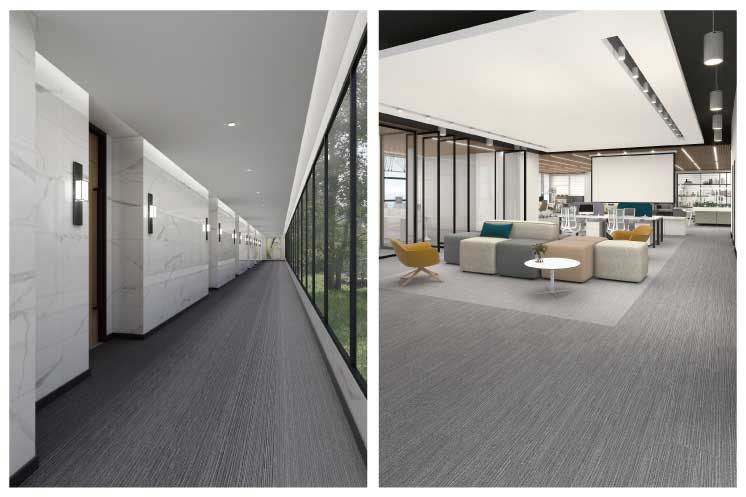
Ando captures how natural light shifts across concrete surfaces through nuanced greys—soft and serene at dawn, solemn and restrained at noon, gentle and warm at dusk.KARATILE Approach: Vivid color isn't necessary. Our "PJ" collection offers nine grades of greyscale carpet tile, while "DQ" planks create gradual tonal transitions. The result is a floor that behaves like Ando's fair-faced concrete, revealing texture and emotional depth as daylight changes.
Learning from Luis Barragán: Emotive Color
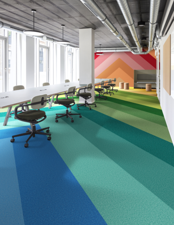
Barragán wielded saturated hues—Mexican pink, sunset orange, tranquil blue—transforming walls into emotional instruments beneath the sun.KARATILE Approach: Extend wall-bound color language to the floor. Select high-saturation tones like terracotta pink or solar orange from our "CCP" series for lounge or reception areas. The plush surface of office carpet tile naturally softens visual intensity, wrapping boldness in warmth and tactility.
Learning from Alvar Aalto: Nature's Palette and Organic Form
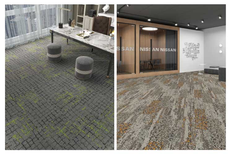
Aalto extracted color from landscape—lake grey-blue, bark brown, moss green—and married them with fluid curves.KARATILE Approach: Avoid rigid chromatic divisions Use "LUCY" and "TIYA" series in sage green or warm ochre to simulate earth textures, or blend "BK" and "KELY" series in blue-green tones. The mix creates environments that feel organic, vibrant, and quietly alive.
Learning from Peter Zumthor: The Poetry of Material and Light
Zumthor's architecture celebrates material essence—wood, stone, concrete revealing their history through light.KARATILE Approach: Choose textured series like "ACP," "XIW," "MX," or "TID," with colors rooted in linen, rock, and raw timber. Strategic lighting casts shifting shadows across the carpet surface, quietly amplifying material presence and thermal quality.
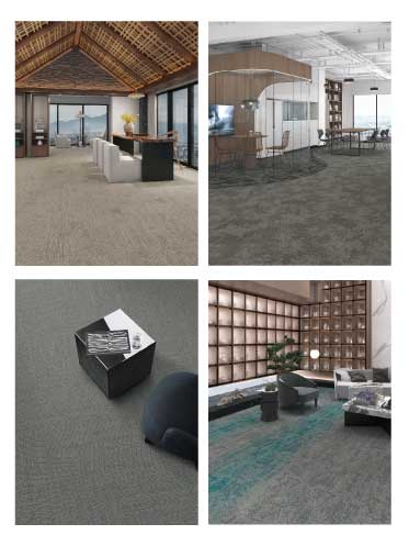
Inspiration from masters. Space defined by you.
KARATILE provides comprehensive support for your vision:
• 400+ SKUs spanning color and texture
• Diverse systems for gradient, solid, linear, textured, and light-interactive expression
• Modular installation offering maximum creative flexibility
You need not be a master to think like one.
Start with a single KARATILE carpet tile. Write the opening chapter of your space's story.
For procurement review
Decision comparison
| Goal | Floor strategy | Validate on site |
|---|---|---|
| Focus | Low contrast and continuous texture | Workstation view and glare |
| Collaboration | Colour zoning or direction shifts | Meeting boundaries and circulation |
| Wayfinding | Colour bands, texture or modular rhythm | Recognition from entry to destination |
| Brand | Control base and accent ratios | Colour under light and at scale |
Claim → Evidence
How claims map to evidence
ClaimThe scheme supports spatial zoning
EvidenceFunction/circulation plan + floor layout + site observation
ClaimColour and texture suit the project
EvidencePhysical colour and larger mock-up under project lighting
ClaimA complex pattern can be delivered
EvidenceModule, direction, datum, edge and waste instructions
When product-specific evidence is unavailable, retain the verification method and boundary instead of presenting an assumption as fact.
Process map
From question to delivery
- 01Read the spaceFunction, circulation, acoustics and brand
- 02Build the floor languageBase colour, accents, texture and scale
- 03Plan modulesDirection, edges and material transitions
- 04Mock up on siteApprove under real light and retain a control sample
Retain samples, specifications or approval records at every step so decisions survive the handoff from design to procurement and installation.
FAQ
Frequently asked questions
What should be checked first for “Architect-Inspired Palettes: Using Carpet to Build Spatial Atmospheres”?
Confirm the relevant zones, intensity, schedule, budget and maintenance conditions, then verify each conclusion against physical samples, the exact data sheet and valid evidence.
Must an office use one carpet throughout?
No. A consistent collection can use colour, texture or installation direction to distinguish focus, collaboration, circulation and reception zones.
Why can a rendering not replace a physical sample?
Screen colour, project lighting, viewing distance and installed scale all change perception. Renderings shortlist; samples approve.
How can complex patterns be delivered reliably?
Fix the module, datum lines, tile arrows, edge details and waste allowance, then approve a small layout mock-up.
Evidence and further reading
Sources
International research / technical sources
- JLL:2026 全球空间设计趋势research
- Tarkett:2026 商用地板流行趋势brand
- Shaw Contract:设计中心brand
References support standard status, industry methods or design context and do not endorse every third-party claim.
Continue reading
More from this decision path
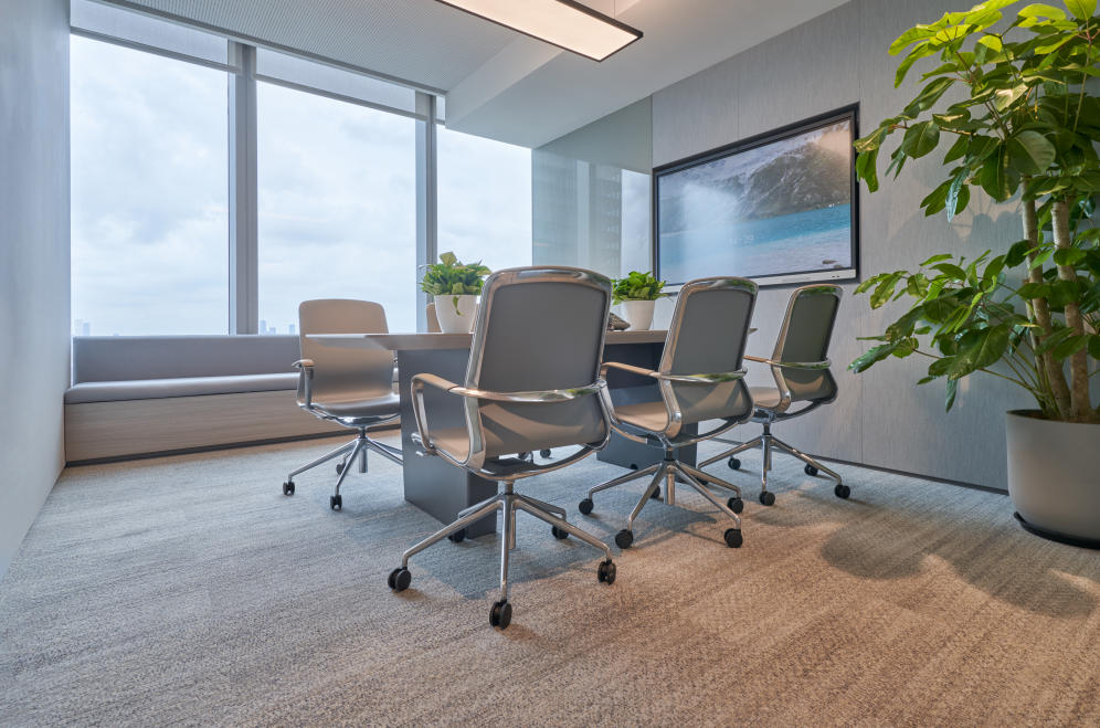 Carpet Tile Aesthetics: How Colour, Pattern and Modularity Shape Commercial Spaces
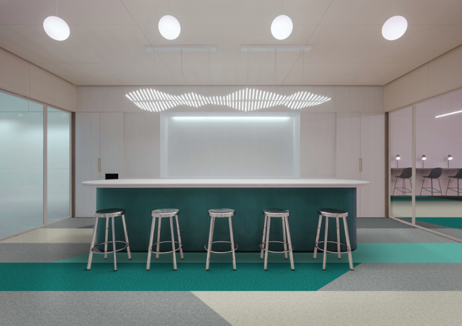 Beyond Gray: 33 Colors Redefining Office Carpet Tiles
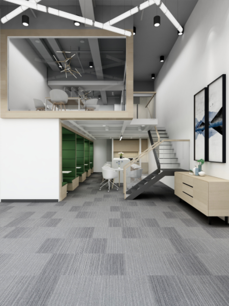 Gradient Carpet Tile Design: Colour Matrices and Project Delivery
Internal knowledge links
From knowledge to products and applications
Next step
Request colour cards and layout support
Share project city, area, zones, schedule, budget and reference images for a response using the same decision model.